The problem
Waiting for a table to be free in a restaurant queue is frustrating, waiting a long time without knowing when your food is ready can also tarnish the diners experience.
Role- UX designer
The product
A restaurant booking app that allows the user to search for their desired restaurants, book a table at a specified date, order whilst at the restaurant and pay through the app.
Framework- Design thinking model
The goal
To create a mobile app that allows users to book a table at their chosen restaurant. The user can order food from the app whilst at the restaurant. They can pay by various payment methods to keep customers happy and satisfied.
Duration- 7 weeks
Empathise
Summary
This stage allowed me to put myself in the user’s shoes, I was able to understand the user’s needs and pain points. I decided to use primary research for this project, interviews to be exact. Before interviewing, I outlined the research goal, research questions, and my target audience for the research.
Research questions
-Do people struggle to read menus at restaurants?
-Do long food prep times and waiting for tables frustrate people?
-Would people like to use different payment methods other than card or cash?
-Do people tend to reserve a table before going to a restaurant?
-Forgetting your card and not having cash, so more payment options like PayPal would be great.
-Not going to a restaurant due to a desired date and time not being available.
-Waiting for tables at a restaurant and not knowing when an order will be ready are frustrations.
-Waiting for food orders in general can be frustrating
After the interview, I created user personas to further empathise with the user because I knew it would allow me to help understand their pain points and goals in greater depth.
User journey maps
I then created user journey maps to show the actions users do to reach their goals, these actions were broken down into smaller tasks. It also shows the emotions they go through whilst doing those tasks alongside any improvements to the processes. I created two journey maps for the two personas above to help me understand the key pain points even more.
Common themes from the interview
User personas
Define
After empathising with the user, I moved on to the define phase in which I used my findings to define the problem. I created two problem statements, these describe the user’s needs my design must address.
Problem statement
Loic: Loic is a student who needs to be able to order food and earn points to then use those points to order food another time because he is a student and is low on money at times.
Josephine: Josephine is a nurse who needs to be able to book a table without having to queue up for one to be free because she would love to spend the little time she has with her daughter due to her busy schedule.
How might we
How might we create a restaurant booking experience, so restaurant goers can reserve a table at a restaurant efficiently?
How might we create an easy-to-use mobile app that allows the user to reserve a table at a restaurant and order food while at the restaurant from the app?
How might we design a mobile app that allows restaurant goers to easily reserve a table at their desired restaurant and order food from the platform, rather than calling to book or queuing for a table at the restaurant?
After writing problem statements I did a “how might we” exercise, this allowed me to understand the design problems even better.
How might we let users know how long approximately their meal will take to be ready?
How might we find a way to give the user more of an incentive to keep using the mobile app?
How might we make a way for restaurant goers to be able to order food without cash or a card?
Ideate
I moved on to the “ideate” phase, this phase was extremely important as it allowed me to think of creative solutions to the problem.
Brainstorming
I then started brainstorming ideas for the home screen first, these were sketches of interfaces I had thought of without any judgment.
After brainstorming different ideas for the home screen, I put an asterisk next to each design feature and style from different home screen sketches, these were features I wanted to pick for my chosen home screen look.
User flow
Information architecture
A user flow was then created to show how the user of the product would get from point A to point B. Over time, the flow changed as I iterated on the general experience and flow of the app.
Information architecture is a way of organising the structure of the app. Later in the project, I altered this due to changes in the design and flow of the app.
Storyboard
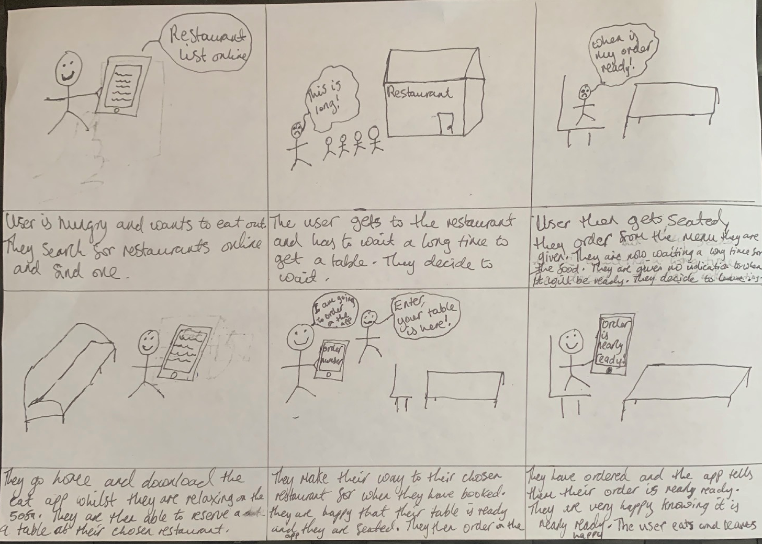
I created a “big picture” storyboard to highlight how the solution would solve the user’s problem. The storyboard's main aim is to focus on the user experience within context.
Prototype
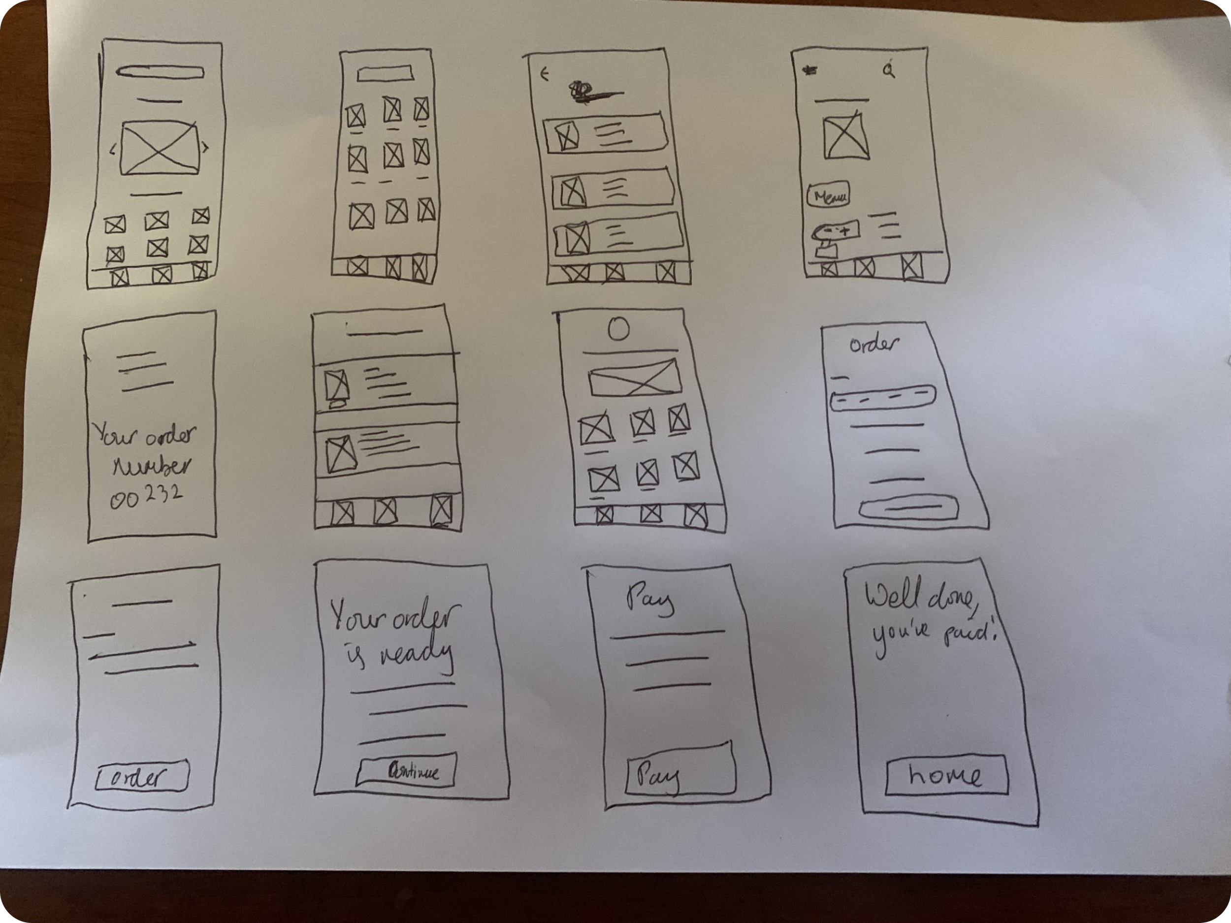
Paper wireframes
I referred back to my brainstormed ideas in the ideation phase to help me create paper wireframes first. The set of paper wireframes were the chosen screens I pulled from various other sketches I did.
I began the prototype stage which involved creating paper wireframes, low and high-fidelity mockups.
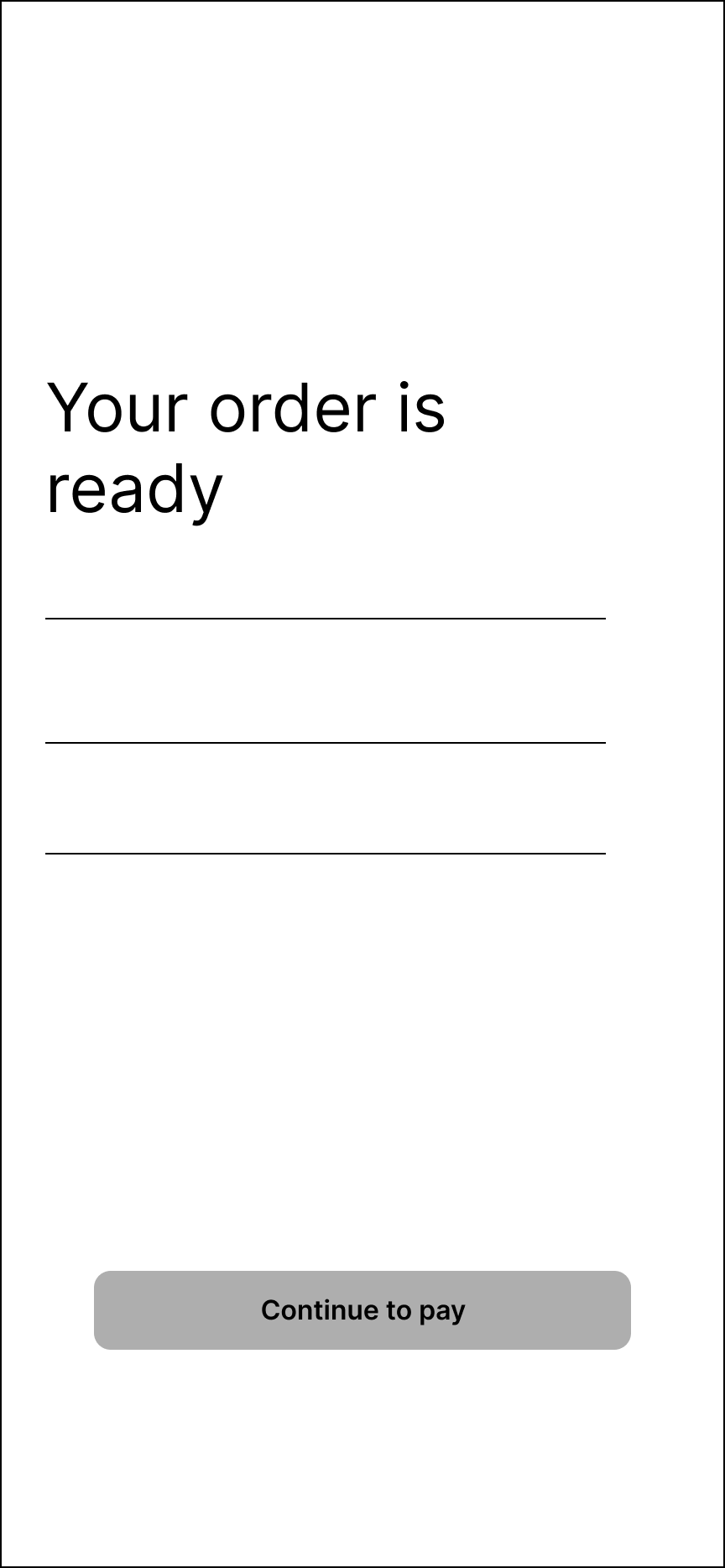
Low-fidelity mockups
High-fidelity mockups
Final prototype
Final prototype feedback
I transformed the mockups above into a low-fidelity prototype, and a guerrilla test on users was done which gave me clarity on things that needed to be improved and implemented into the high-fidelity prototype.
Users mentioned that I should reduce the number of clicks needed to book, one of the ways mentioned was to remove the calendar screen and make the users choose their dates on the initial screen.
Another issue was that after the users clicked on the “Reserve” button, it took them straight to a screen stating they had reserved the restaurant, users would like a screen allowing them to review their reservation before reserving. They also wanted a way to select times to book and for the app to show which times are available and unavailable.
I chose to conduct a moderated usability study, I chose 5 participants all from diverse backgrounds, these participants fit into the target audience for the product itself. I set out specific tasks for them to complete on the Eat app whilst I observed them and made notes on their behaviours and quotes.
Person 1- “I like the look, the flow makes sense”
Person 2- “Navigating is easy and I like how I am told how long is left for the food to be prepared, I am kept in the loop”
Person 3- “The option to pay by points attained or even by Google Pay and Apple Pay is great”
Person 4- “I like the fact that choosing dates, times and number of people are all on one screen, some apps take you to a different screen, and this can be annoying”
Person 5- “I had a positive experience using this app, but it would be great to see a total estimated food prep time”
Conclusion
I enjoyed this project, I believe I achieved what I wanted to achieve in terms of solving the problem outlined at the start of the project. I feel I created an accessible product with my colour choice and typography being web-safe. I also chose not to include many gestures. If the app were to be developed, It has the potential to improve restaurant attendance and increase revenue.


